DEATH!
How’s that for a title? Heh.
I’ve been telling people for quite a while now—since I was about 30—that I’m middle-aged. And for as long as I’ve been doing that, people have been telling me I am not middle-aged, to which I respond “how long do you expect me to live? I don’t think most people live beyond 60—the numbers are just skewed, because there are a few people living to a ripe old age, and making the average higher.” I had a similar conversation today:
Tara says:
allo guv'na
sernaferna says:
Morning.
Tara says:
how's life? You've been very scarce lately. Are you hiding from The Man?
sernaferna says:
I *am* the man.  Middle-aged, middle class, white guy?
I couldn't be more "the man" without joining the police force...
Tara says:
you're not middle aged, serna.
sernaferna says:
How old exactly do you think I'm going to get? 
Tara says:
I dunno...  a hundred?
Tara says:
64 isn't really a huge goal to strive for, physically, serna.
sernaferna says:
When I get back from my meeting, I'm going to have to look up some statistics, and find out how long people are living. If I remember.
Which I won't.
sernaferna says:
What I'd really like to see is some kind of bar chart, showing "X number of people live to 1, and X number live to 2, and X number live to 3..." etc. 
Tara says:
that's... that's a really depressing bar chart.
you have an obsession with bar charts and pie charts and spreadsheets
Later on, Tara gave me a URL to a document on the Stats Can website, which had listed out all of the deaths for 2003, by age (and sex, and geography, etc.). From which I was able to produce the following graph in Excel: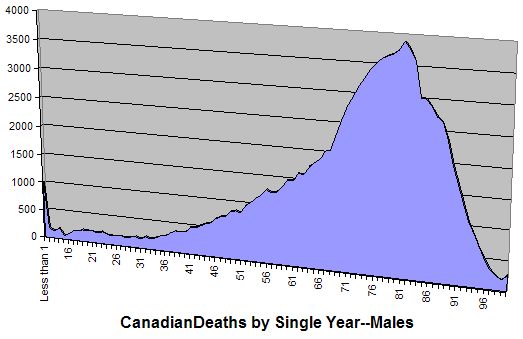
These are statistics for men who died in 2003, in Canada. I could have been more specific, and taken only men who died in Ontario in 2003—the PDF at the URL mentioned above has the numbers broken down by region—but I was trying to maintain a happy medium, between being precise, but not too precise. It may not be clear, if you’re looking at that graph, but the highest point is 81, meaning that, in 2003, more men were 81 when they died than any other age.
I did a quick calculation for weighted average, and I found that the average age men were when they died in 2003 was 70.9. Unfortunately, statistics are not my forté, so I can’t be 100% sure that this is correct. Also, some of the statistics were for ranges of years, instead of years; for example, the Stats Can numbers are for people under 1 (which I made 0.5 for the weighted average), then 1–4 (for which I used 2.5), etc. Then from 15–99 they listed each year individually, and finally had a category for 100 and over, which I made 100. However, for my purposes, this is good enough.
Then I started playing around with the numbers some more. The first question is, “am I middle-aged?” Well, if I am, then at least half of the people who died in 2003 would have to have been younger than 62, because I’m 31. So I tallied up the following:
| Range | Number |
|---|---|
| Under 62 | 26,467 |
| 62–85 | 68,569 |
| Over 85 | 19,864 |
which corresponds to this graph:

I’m not happy with having a range of 62–85 in there, but again, for my purposes, this is good enough. As you can see, the majority of people die between the ages of 62 and 85—much higher than I’d been expecting. And there’s still a significant number of people who die after 85.
So, the overall good news is that people were right, and I have been wrong. I’m not yet what I would consider “middle-aged”.


2 comments:
By the way, I know there are probably lots of things on this post that people could nit-pick about.
So I'll put in my standard message: I don't care. If you're going to post a comment, and tell me I have a problem with one of my graphs, just save yourself the time and effort, and go do something useful instead.
*stares in disbelief*
Post a Comment